Logo
01Before
After
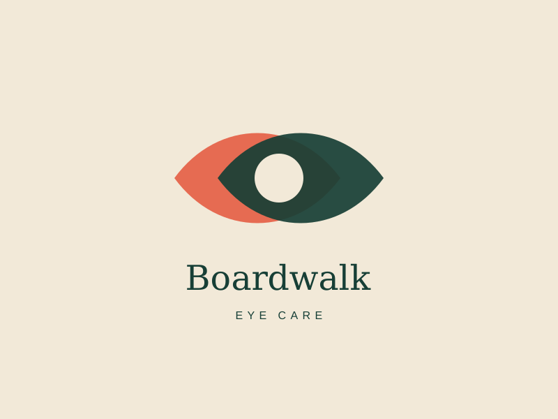
A distinct lens-shaped mark replaced a generic eye graphic and gave the practice an ownable symbol.
Boardwalk Eye Care, full rebrand
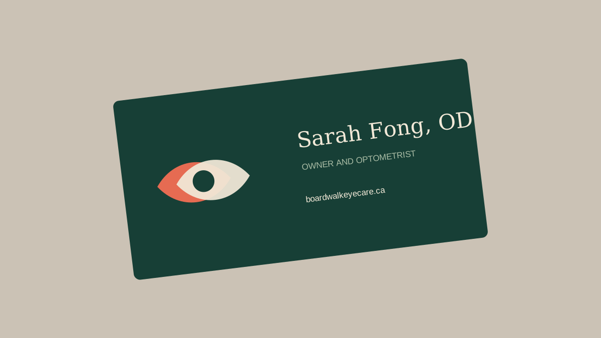
Sarah Fong, Owner and Optometrist, Boardwalk Eye Care.
Before
After
A distinct lens-shaped mark replaced a generic eye graphic and gave the practice an ownable symbol.
Before

After

The new wordmark feels established and warm, with enough clarity for storefront signage.
Before
After
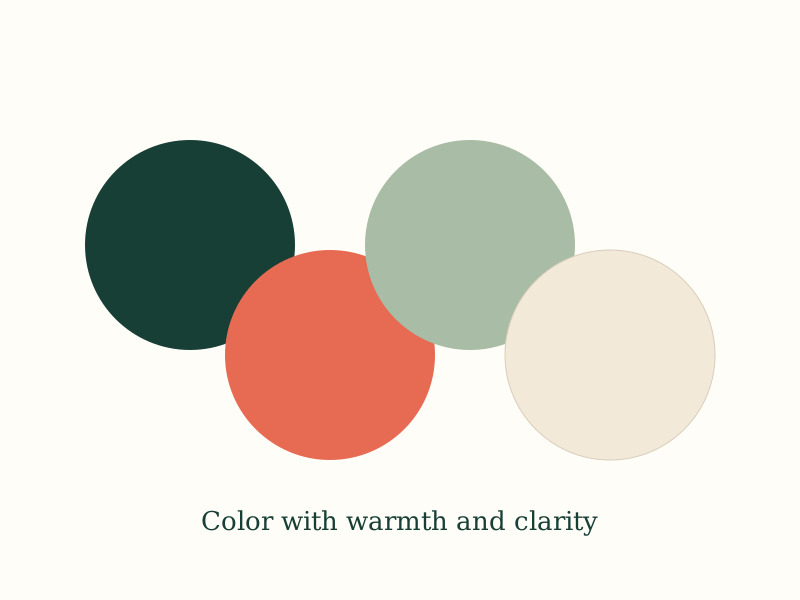
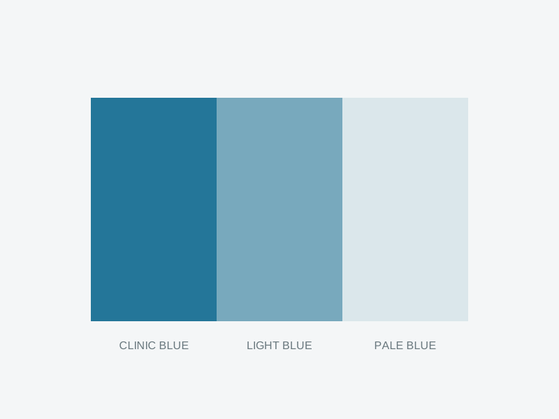
Forest, coral, and cream bring personality to the practice without losing clinical trust.
Before

After
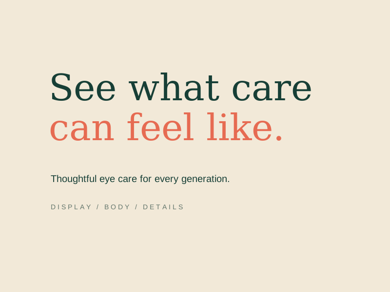
A confident serif and a practical sans serif create a clear, approachable reading hierarchy.
Before
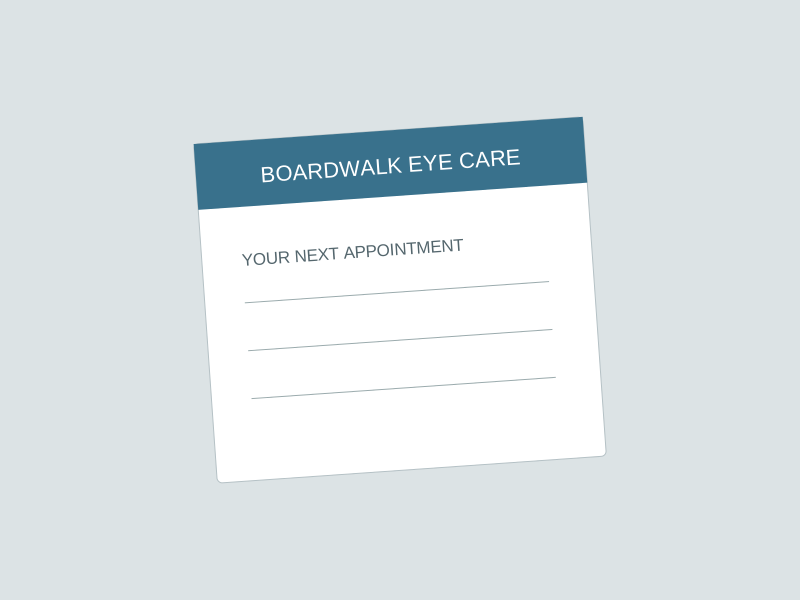
After
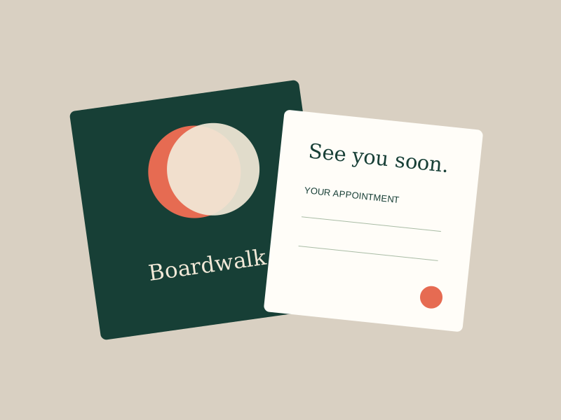
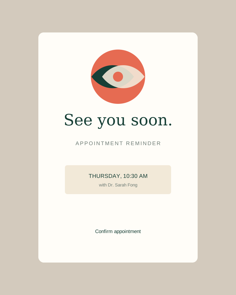
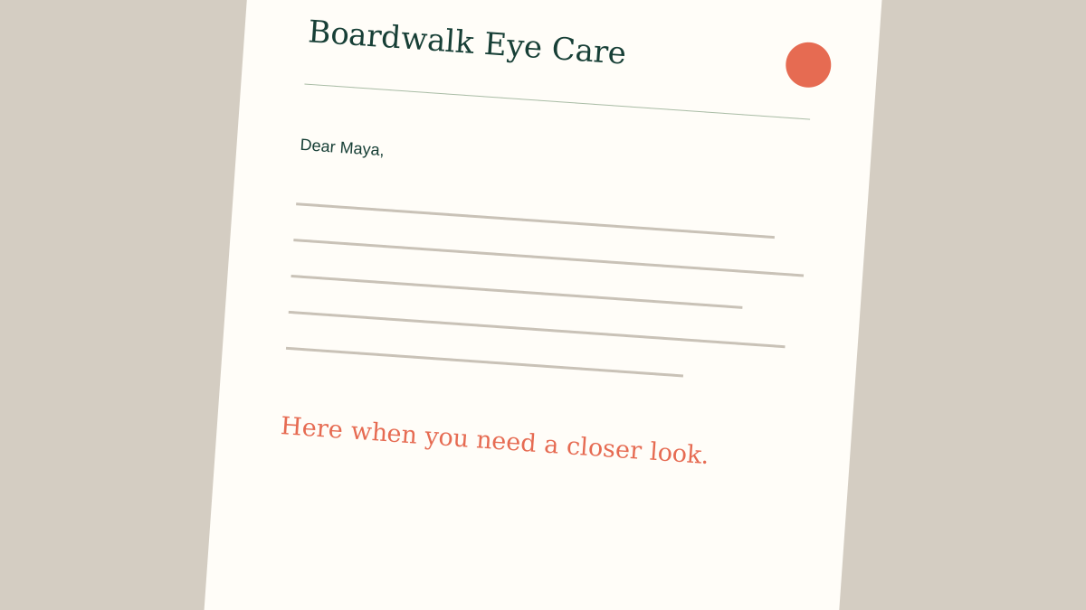
Every patient touchpoint now feels considered, from appointment reminders to referral cards.
Before
After
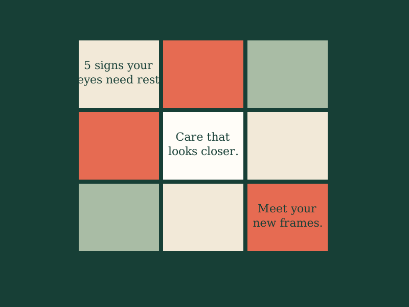
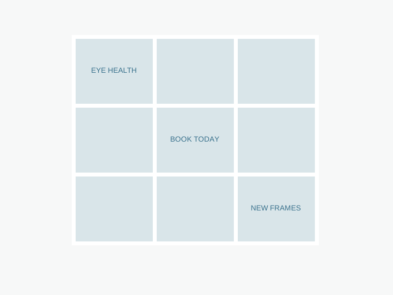
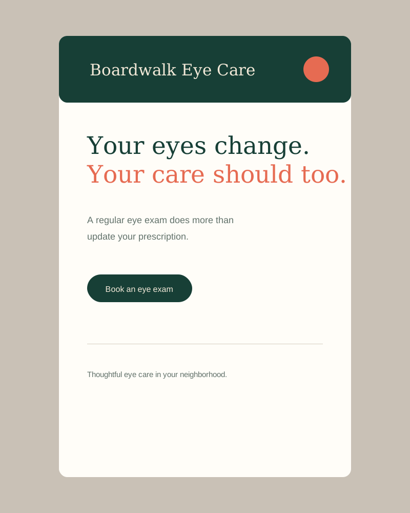
A flexible template system makes useful eye care advice recognizable at a glance.
Boardwalk had been serving families in the neighborhood for 20 years, but the brand looked like it had not been touched since the practice opened. Sarah wanted something that reflected the care and expertise patients actually got when they walked in, not a generic clinical logo pulled from a template.
01, Strategy and positioning
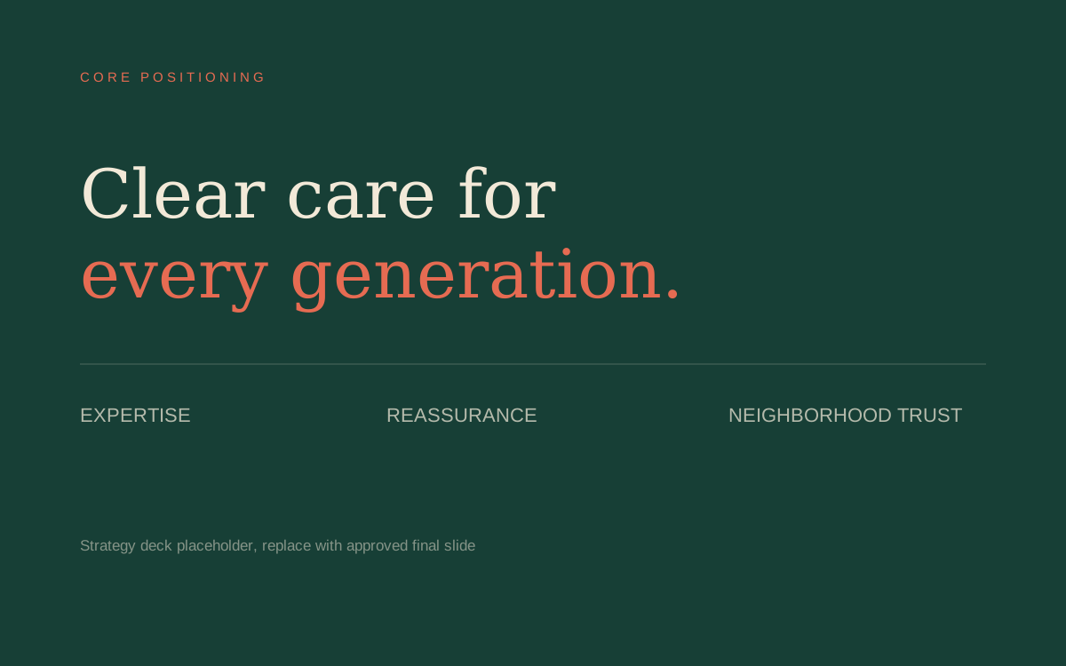
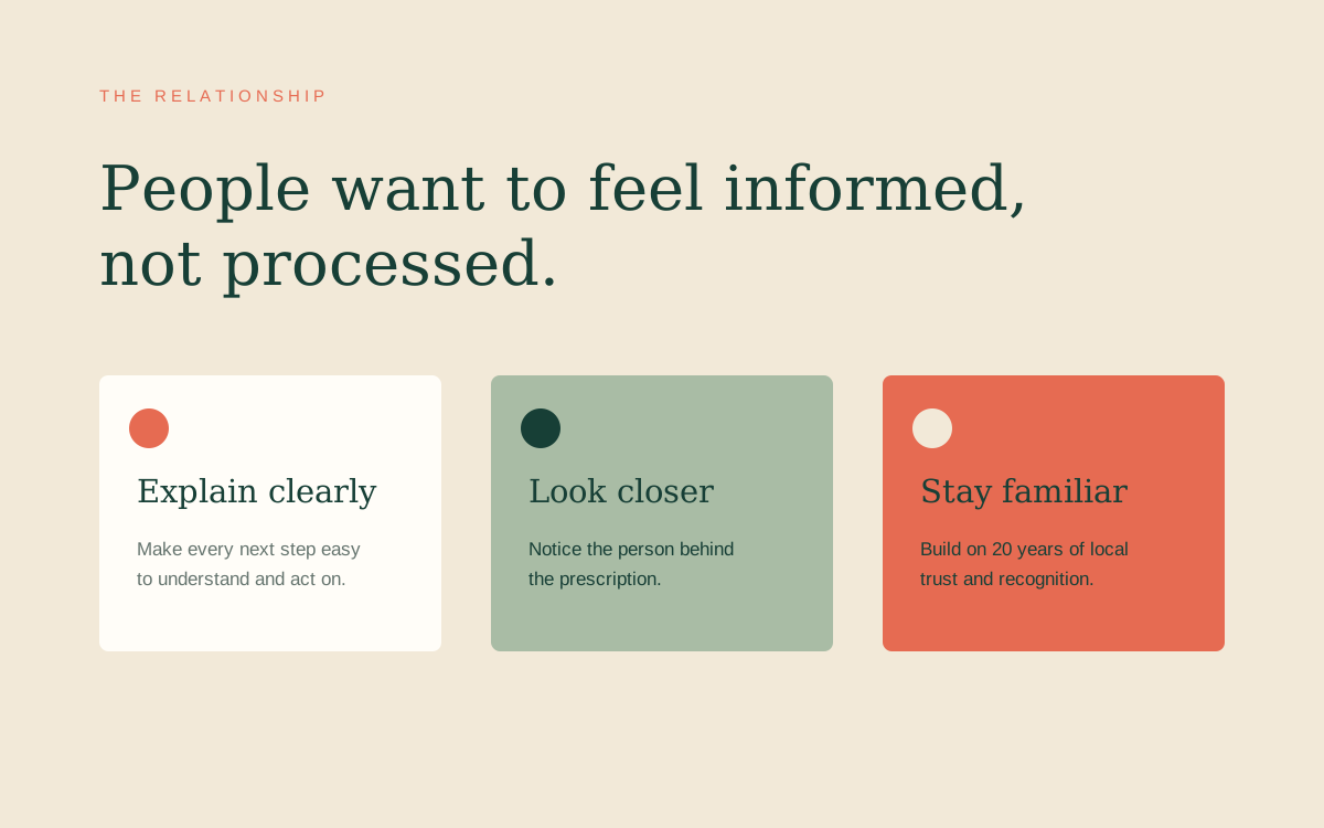
Boardwalk already had what many practices spend years trying to earn: trust across generations of local families. The strategy made that relationship visible, positioning the practice as the clear, reassuring guide that helps patients feel informed at every stage of eye care.
02, The mark
The mark brings two simple lens forms together around a central pupil. It reads instantly as eye care, but its soft geometry and subtle overlap make it feel human, collaborative, and specific to Boardwalk.

03, Color and type
Deep forest green anchors the system in expertise, while coral adds warmth at the moments that need attention. A soft cream background reduces the sterile feel common in health care, and the type pairing keeps information easy to scan in print and on screen.
Boardwalk Forest
#173F36
Primary brand
Warm Coral
#E66B52
Actions and highlights
Exam Room Cream
#F2E9D8
Primary background
Soft Sage
#A9BCA5
Secondary fields
Clear White
#FFFDF8
Contrast and space

04, In application
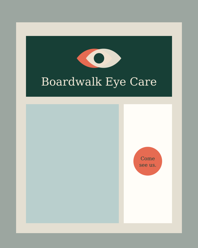
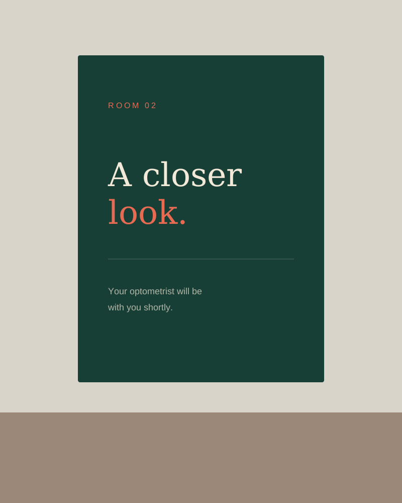
The system was designed around the real moments patients see most often. From the front window to a reminder in their inbox, every piece uses the same calm voice, clear hierarchy, and familiar visual cues.

The rebrand made us feel like a proper practice again. Patients have started noticing, and I have had more people compliment the space in the last month than in the last five years combined.

Sarah Fong
Owner and Optometrist